/ 18 min read
Google Summer of Code 2024
On The GSoC open source code project I worked on: Refactoring Arviz (May-September 2024)
Last Updated:

Introduction
This is an amalgamated biweekly blog on the 14 week GSoC project I worked on this summer, briefly documenting some of my thoughts and learnings while working on this project. For a final overview
document I made of the work I did and actual links to the PRs I pushed, check out the README.md file on
this public repo on my Github.
What’s GSoC? Google Summer of Code is a popular annual summer program sponsored by Google, aimed at bringing new developers into open source development. Prospective contributors write proposals for work on open source projects for various organizations- if selected, they carry out that open source work under mentorship for an organisation and get paid for the work by Google. It’s a very good learning experience, and it also feels good to have pushed code and have solved problems with your contributions. (And to have done your part feeding open code for future AI models to learn from and get better, pushing net human technological progress. As all open source code does!).
For my GSoC project, I worked on Arviz, which is an exploratory analysis and visualization tool for bayesian inference models. These models can be created with other tools like PyMC, for data science problems where more conventional machine learning methods aren’t a best fit. Arviz then helps visualize the complex data produced.
Specifically, I worked on refactoring the exist plotting functionality in a new Python package currently being developed called Arviz-Plots, which features a lot of built-in improvements compared to existing main Python package of Arviz (both from user and developer-centric perspectives). The mentors for my project were Oriol Abril Pla and Osvaldo Martin.
For further resources on the usage of Arviz, you could refer to these resources.
Week 2 (9th June)
The GSoC coding period started May 27th, 2024. For the first week, my work according to the proposal I’d drawn up originally was to more closely investigate the plots to be implemented in the new Arviz-Plots package and make a better plan. This includes what order to implement the plots in, what common visual elements have to be developed and “batteries” to add to the plots. Communication with Oriol, my mentor, was on Slack as well as a regular weekly meeting time set up for Arviz-Plots development related meetings.
I was also suggested to begin identifying unresolved issues with the existing plot implementations in current Arviz, to get a better idea about them, so I spent some time on this at first too- going through all of the open issues on the old Arviz repo and noting down what work was left, what didn’t work yet/was buggy and what extra features users wanted. Not all of these would necessarily be implemented immediately in Arviz-Plots, but it helped to get a gauge of what was missing from existing Arviz as well though.
A few of these, and the categories they were in:
- Some changes mined from the unclosed issues were aesthetic in nature: Like adding and color-coding chains in
plot_pair, passing in separate ‘alphas’ for each quantile inplot_kde, and makingplot_forestsubplots extend horizontally instead of vertically. - Others were statistical, involving the additions of plot elements like HDIs and errorbars (there was significant discussion on some of these on how exactly to
calculate these in a way that made sense however, like with HDI intervals for
plot_ppc), - And some more requested extra features, like adding ‘weights’ to bins and adding circular plots to
plot_trace’s Bokeh backend.
I also noted down the visual elements to be developed, through looking at the example gallery and what might be necessary that weren’t in Arviz-Plots already.
I began to work on the first plot as well- plot_ppc. The ‘PPC’ stands for plot prior/posterior predictive check- and it aims to display this data visually. Why is representing bayesian inference data visually even so important? Because the raw data for a PPC plot (before statistical computation) looks like this:
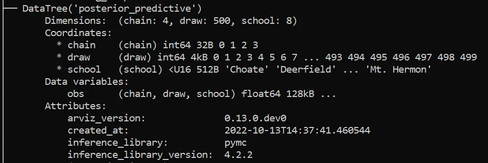


^These examples of sample data are from the ‘centered_eight’ dataset preloaded in Arviz. When you open up one of the DataArrays inside the ‘obs’ variables in each Dataset, convert it into a Numpy array and print it:
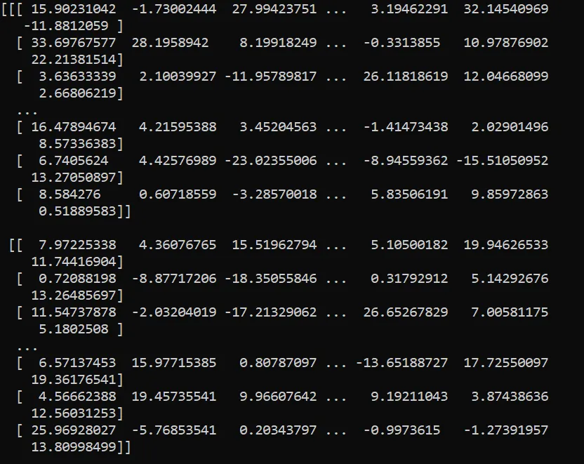
That’s 16,000 float numbers- not easy to interpret! When called with plot_ppc and after internal computation of the kde curves via Arviz-Stats, a user analyzing this data gets a much more useful, compact visualization:
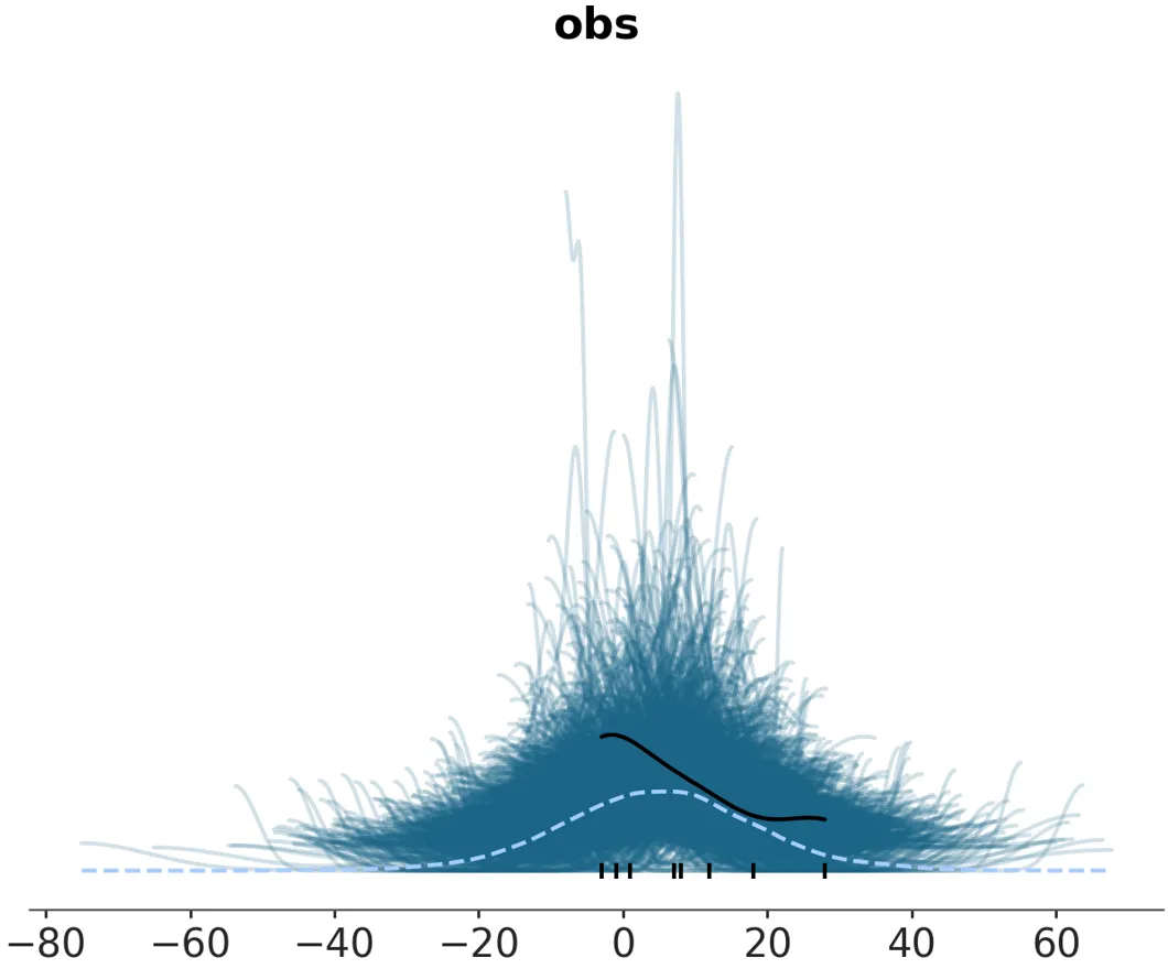
With Arviz-Plots’ PlotCollection, this can be facetted into multiple subplots easily when there are multiple variables and coordinates in a Dataset that you want to plot separately.
I also set up my local coding environment in a more structured way in this initial phase of the coding period. I created a conda environment in a parent folder with folders inside for the arviz-plots package (in an editable installation so edits would reflect when this package was called locally), the legacy arviz package (in a similarly editable installation), and an arviz-plots-playground folder where I kept executable scripts to run examples of the plots with different arguments and store the Matplotlib backend outputs generated.
Week 4 (23rd June)
The PPC plot was harder than I’d anticipated to implement. The exact meaning behind what the posterior predictive check data actually were, how they were stored in the default DataTrees Arviz-Base has loaded in (what was formerly of the InferenceData data type in legacy Arviz) and how the reducing and facetting was supposed to work required me to dig into the theory of bayesian inference a bit more. Unlike the ‘posterior’ and ‘prior’ group Datasets, which had variables like ‘mu’, ‘theta’, and ‘tau’ (for the ‘centered_eight’ data), the ‘posterior_predictive” only had an ‘obs’ variable (again, this a specific example that applied to ‘centered_eight’ data only)- the reason’s more obvious once you understand how the modelling that produced this data works, and why you need at least one extra dimension to reduce along apart from the sampling dimensions to generate KDE curves to plot.
Here’s more on prior predictive checks(understanding your assumptions) and posterior predictive checks (understanding your predictions).
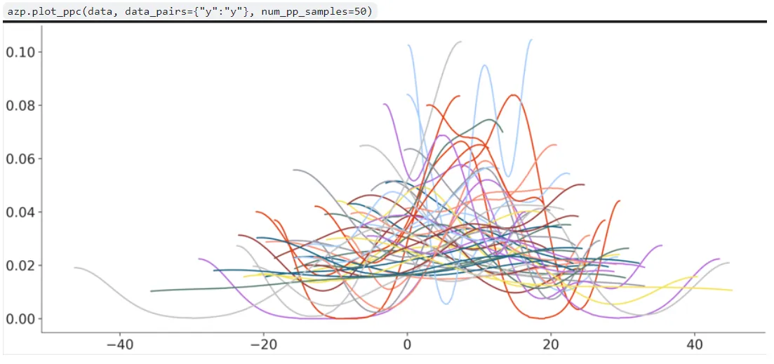
It took me some time getting an idea of how the codebase was put together and how to create a new plotting function well but I managed to push out a first draft implementation of plot_ppc in a PR. I managed to get the KDE computation and overlapping done for the predictive data, but the aesthetics mappings at least seemed extremely out of place:
There were a lot of other issues with this first attempted implementation which my mentor pointed out in code reviews, which can be seen in the PR comment history. Some key changes from legacy plot_ppc were also suggested- the ‘flatten’ argument for example was done away with- only ‘overlay’ dimensions and ‘facet’ dimensions had to be specified, and the remaining are reduced by default.
The intricacies of handling the aesthetics mappings, the use of the PlotCollection class and making sure plotting function’s code met the conventions set in Arviz-Plots got more clear to me though.
Week 6 (7th July)
I made a lot of updates to the plot_ppc PR, introduced two new PRs for plot_ridge and plot_ess, and also made updates to the plot_dist branch PR for adding histogram support to it- which I’d started before the GSoC coding period:
With plot_ppc, some further argument defaults and handling conventions were discussed and thought out. For instance, ‘facet_dims’ was both a top-level keyword argument but could also be mentioned through the pc_kwargs dictionary argument. The new plot_kwargs, pc_kwargs, and aes_map dictionary arguments that Arviz-Plots plotting functions support enable a lot of functionality control to users through the PlotCollection class, but these clashes with top level arguments in individual plots have to be resolved on a case by case basis. Otherwise, there’s redundancy and could also lead to inconsistencies if a user provided conflicting arguments of both kinds. We were thinking about whether one should take precedence or an error should be raised instead.
Eventually, the error raising path was taken, like plot_forest. Similarly for the observed argument, which could also be toggled on or off via plot_kwargs like any other artist in the plot.
Another major change to plot_ppc was a restructuring to call plot_dist internally, allowing it to take care of the statistical computing and artist generation of KDE curves, and with arguments to it configured from plot_ppc inputs and defaults.
plot_ridge was comparitively far more straightforward to implement owing to similarities with plot_forest. Only, instead of purely credible intervals and point estimates, plot_ridge aims to visually depict marginal densities with KDE curves. In my initial PR, I also added a baseline artist below the kde curves, added user-defined rescaling for the y-axis height of the KDE curves and modified the line_xy visual element to add aesthetic mapping defined ‘y’ values to to the subsetted dataarray values along plot_axis=‘y’ the PlotCollection.map() function passed to it, so that the KDEs would be at their correct heights in relation to the plot as a whole.
Once again, various changes and logic tweaking was made after code review and discussion with my mentor. The ones on Github can be viewed in the PR comment history again. The rescaling logic in particular was changed, to keep proportions of the KDE curve intact but allow the user to adjust the amount of ridge overlap. Also, a ‘face’ artist was also added with the fill_between_y visual element function, and I modified this once again to accept the ‘y’ aesthetic mappings set by default for the ridges.
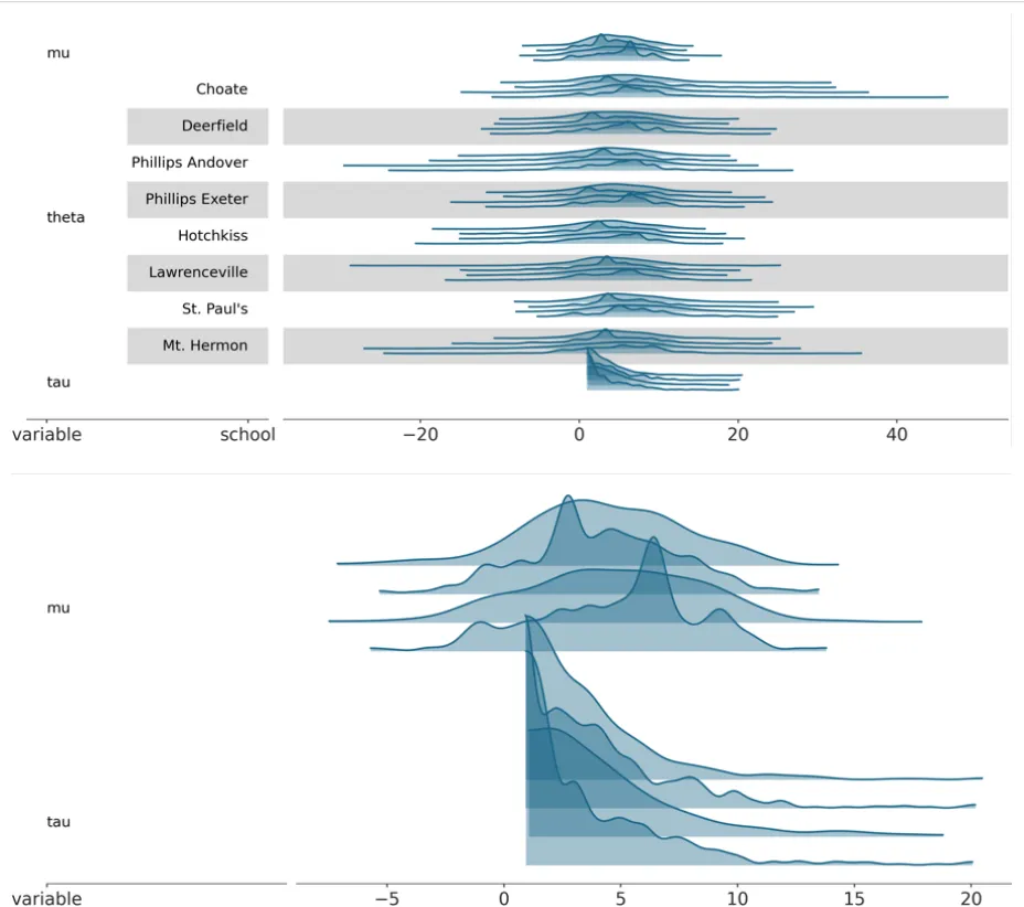
I also added tests for plot-ridge- the plot_forest tests served as a good template to begin from for this due to similarities as stated before.
A draft of plot_ess was also added in a new PR, with support only for kind=‘local’ so far and using the new scatter_xy visual element function I added as part of this PR:
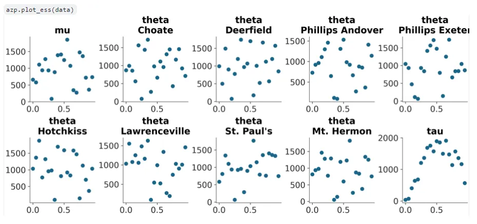
ESS (Effective Sample Size) is a form of diagnostic on a Bayesian model, at a number of points specified by the user. The legacy method of plotting this involved a single plotting function for local, quantile, and evolution ESS. This has been split in Arviz-Plots with kind=‘evolution’ as its own plot now that I’ll implement in the future.
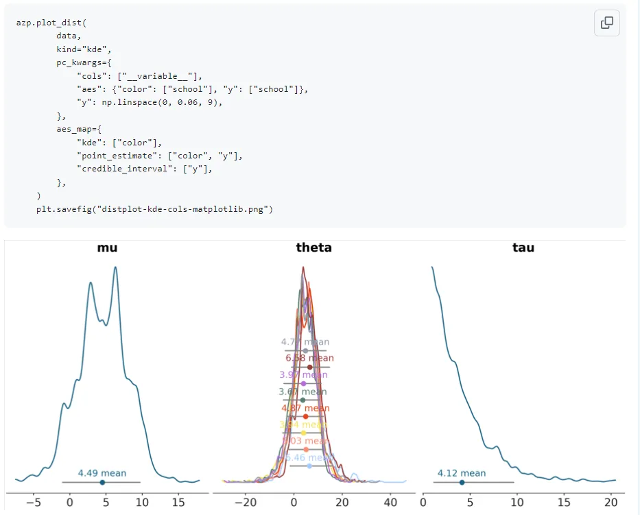
With the plot_dist histogram addition PR, Arviz-Stats now had support for histogram computation so I replaced the erstwhile usage of Xarray-Einstats in my previous implementation for this. I noticed there were issues with the y aesthetic mapping to the credible intervals and point estimates when using this plot with histograms and when there was a dimension with an overlay applied:
plot_dist with kind=‘kde’:
plot_dist with kind=‘hist’:
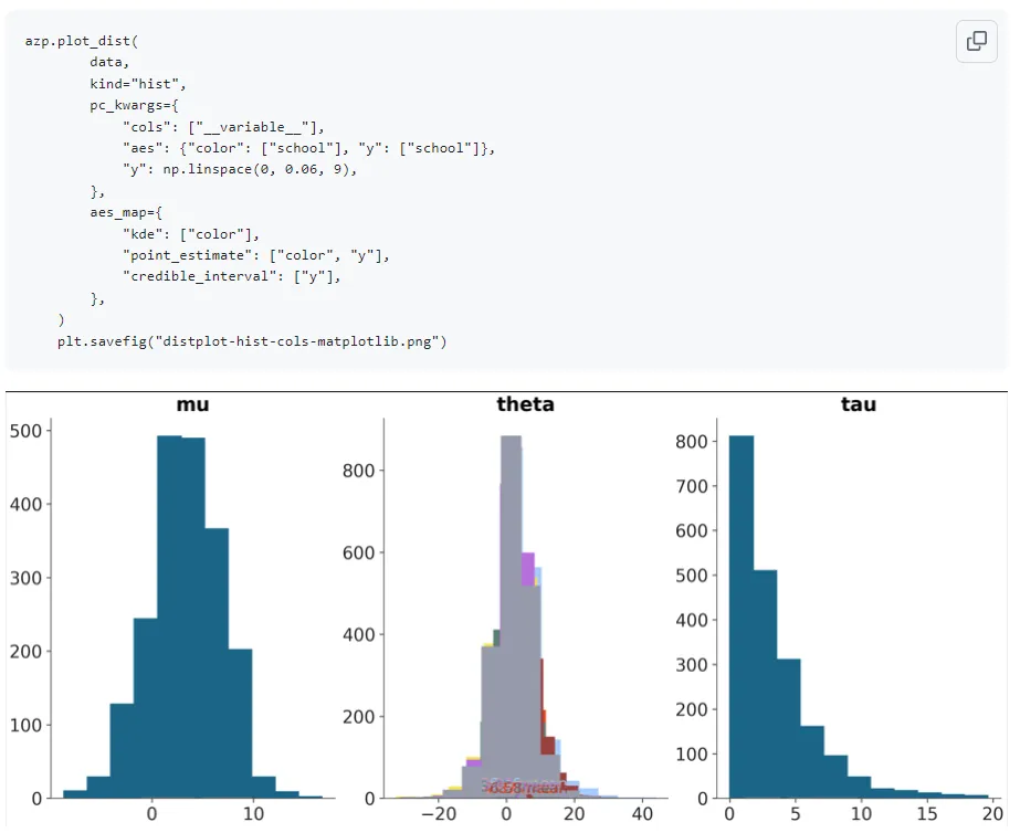
This was fixed by passing density=True for normalization of the histogram area by Arviz-Stats as my mentor suggested though. This is an example of why its important to visually generate multiple renditions of the plots with varying arguments though- the tests did not check for this so it wouldn’t have been caught easily otherwise.
Week 8 (21st July)
Further updates were made to the existing opened PRs, the plot_ess_evolution PR was opened, and plot_ridge was finalized and merged into the main branch. As always, these are just brief mentions of some changes in words. PR comment and commit histories show changes better.
One of plot_ess’s updates was having x-axis aesthetics mapping added along with support for multiple models. To enable this, the scatter_xy function was also updated. Since the default ‘x’ aesthetic mapping generated by PlotCollection was far too big, this was instead set to different logic:
The x_diff is calculated (between any two points on the plot, so this depends on the ‘n_points’ set by the user since the x-axis for ESS plots is between 0-1), and one-third of that is taken as the range within which points of different models can be plotted. np.linspace then ensures an even distribution of the points of whatever number of models to plot within the aforementioned range.
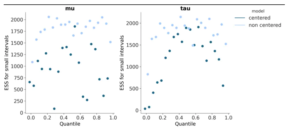
Support for kind=‘quantile’ was also added to plot_ess and some code also added for ‘rugs’. With the rugplots however, correct rug computation requires the rankdata function to become available in Arviz-Stats so the current implementation is more of a placeholder.
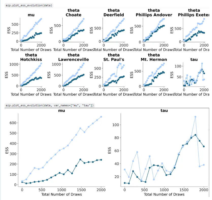
I added a plot_ess_evolution draft as well. Check my previous blog post for more when I introduce plot_ess. There were some changes like checks akin to plot_ess and plot_forest that were added, and the x-aesthetic mapping removed as this plot is not designed to support multiple models- that might get confusing as well since two categories of points (and lines connecting them) are plotted- ‘bulk’ and ‘tail’:
Some more changes to plot_ppc were also made. I also added tests for this plot. This took some time and though as the previous tests could not just be used as cookie cutter templates for this one due to vast differences. The test fixtures had to have additions made too- with observed and predictive data groups added to the DataTrees the fixtures created. This required a lot of iterations and for me to look into and understand the testing mechanisms and logic better too using Pytest and Hypothesis. The trace_rug visual element function I added automatic flattening to due to failing test conditions when multidimensional arrays were passed to it- an example of why tests are important and how they surface non trivial errors and edge cases that are missed when designing code logic.
The plot_dist histogram addition PR had some minor changes and also the addition of the ‘alpha’ argument to the backend ‘hist’ functions.
Week 10 (4th August)
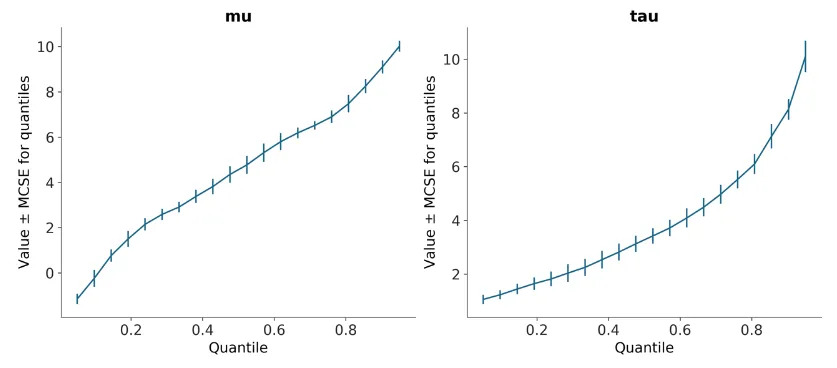
Several further updates to the existing plots were made and plot_mcse also worked on though its yet to have a PR pushed. plot_mcse is another inference diagnostics plot, plotting Monte Carlo Squared Error in a similar visual manner as the style of plot_ess usually. When the unique errorbar argument associated with it is set to True however, different plotting logic and visual elements are used- a new visual element function is being developed for this to depict the errorbars, in the Matplotlib and Bokeh backends.
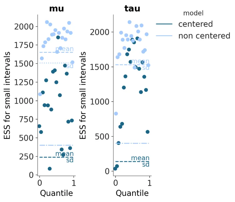
plot_ess got mean, standard deviation and min_ess lines added to them- with the same linestyle and a color mapping applied by default. This didn’t work for when the ‘model’ dimension existed at first though- some strange behavior was observed then with a slant being added to some of the lines. After review, it was decided to map colors to models and linestyles to each of mean, sd, and min_ess and the previous mentioned issue was also rectified with changes. The check for rug was moved prior to computation as well to avoid wasting expensive computation if an error is going to be raised anyway:
plot_ess_evolution got some similar updates as plot_ess, adding in mean, standard deviation and min_ess plot elements and their associated mappings. I also refactored some of the internal code to prevent code duplication (yes, the DRY principle thing) with a common ess dataset computing function now since it can be called upto 4 times in the course of the function’s execution otherwise.
plot_ppc updates included docstring update, updates to the flattening and stacking logic with Xarray within the function based on the number of predictive samples versus total (num_pp_samples and total_pp_samples) and number of sample dimensions too. Various updates to the tests associated with it were also made- parametrization changes, datatree fixture changes and actual assert checks too.
Week 12 (18th August)
Due to the extra time implementing these plots was taking compared to the timeline in my initial proposal, I asked my mentor for an 2 week project extension for this GSoC project- which was granted by the NumFOCUS org admin, raising the total number of weeks from 12 to 14 (plus another week for finalizing things before the submission).
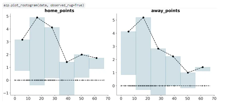
The plot_mcse PR was created and pushed (see more info on this plotting function in the last post) as well as a PR for plot_rootogram, a new plot similar to plot_ppc but for discrete count models- this is a new plot that does not exist in legacy Arviz that was proposed to be implemented in Arviz-Plots for the first time, and involves ‘hanging’ predictive bars from observed values (if you’re that curious, read more from the official paper introducing this plot on ArXiv). As a result, there wasn’t any parallels in legacy Arviz to get inspiration from when I sat down to code this- although I did take some portions from plot_ppc due to some of the initial logical similarities, and an explanation of the plot from my mentor on one of our meetings helped me understand it conceptually better too. More on the eventual intended look of Rootograms in Arviz here.
The ‘hist’ visual element function and relevant Matplotlib and Bokeh backends for it were replicated here from the plot_dist histogram addition branch/PR, with a modification to the Matplotlib backend such that ‘y’ now represents the absolute ‘y’ coordinate/top of the bars and not the ‘height’ of the bar. Proper binning for the Rootogram plot is left, but was implemented with the bins for the first variable taken for now:
I spent a lot time in data manipulation for plot_mcse- having to pore into the Xarray documentation deeply and experiment with multiple ways of trying to do what I wanted, which was some complex subsetting and concatenation before flattening and passing to Arviz-Stats for quantile computation. After lots of loops and heavily commented print statements (visible in the first commit in this PR), I picked a simpler approach that worked and shifted some of this to the new visual element function for errorbars- noting the fact that this was out of convention for visual element functions but a lot simpler than the approach I was trying.
There was a more straightforward way of doing this that I had missed though that my mentor brought up- which resolved these aforementioned issues. plot_mcse outputs at this point (in Matplotlib) with errorbar=False:
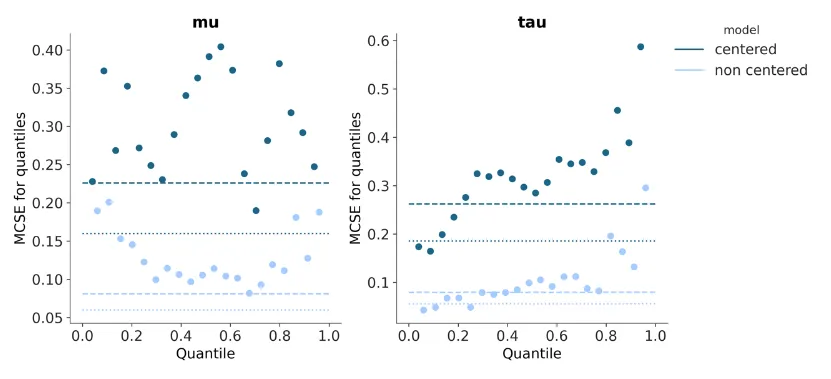
plot_mcse outputs at this point (in Matplotlib) with errorbar=True:
plot_ppc was updated further once again (definitely one of the most troublesome plots out of all the others I’ve implemented so far), with some changes to the tests and some to correct the flattening/stacking logic again.
plot_ess and plot_ess_evolution had the new common visual element function annotate_xy introduced. I added in built-in logic for vertically aligning the mean/sd texts in case of potential overlap as well:
Week 14 (2nd September)
Finally in the final phase of this GSoC project.
In this period, I’ve been refining tests and plotting logic further, and began adding examples for each of the plotting functions I’d added to the Sphinx-generated example gallery of plots for Arviz-Plots and also docstrings of the functions themselves (each representing plot usage from different perspectives- with the former focusing on what kind of plots can be generated overall and the latter on showcasing specific arguments for each plot). Testing and refining the plots required a lot of iterations, as edge cases and harder to fix issues began building up. But more plots have become almost ready to merge into main at this point.
Another thing I began to work on here was plot resizing- after deliberating on this it was decided to alter the plot resizing mechanisms, so I had to make individualized modifications to each of the plot PRs to add this resizing.
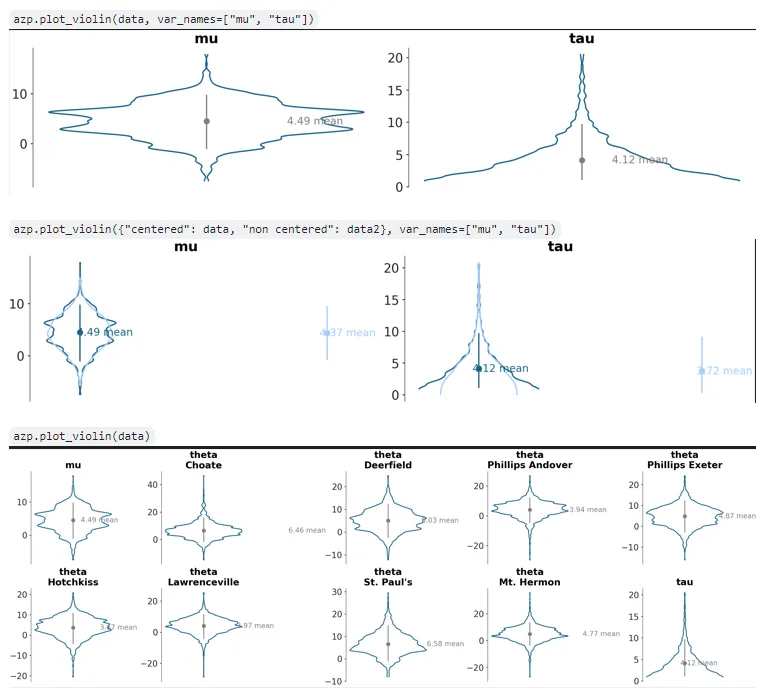
plot_violin, the 7th plotting function PR I’d made, was also pushed- this plot is akin to plot_dist but represents marginal densities along the y-axis rather than the x-axis, and with a left and right kde curve. There was some discussion on this with my mentor on whether to support multiple models (>2) and how to- with overlapping or something else. Eventually it was decided to limit this to 2 models, and map the models to the left and right portions of the violin plot. I introduced a few new but symmetrical visual element functions for this PR: line_y, scatter_y, and a new keyword arg addition ‘negative’ to line_xy. This PR is still under development and requires some aesthetic mapping logic rethinking for the credible interval and point estimate artists in it:
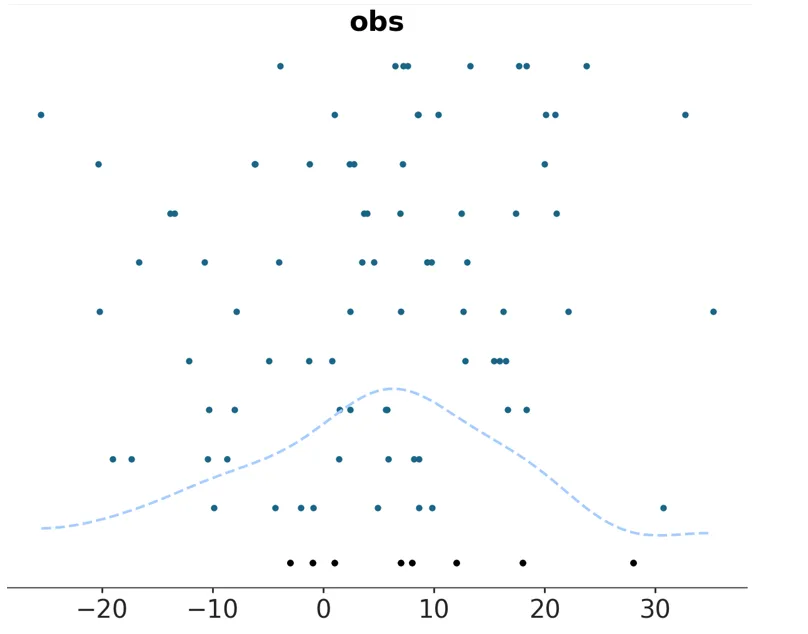
Also added support for kind=‘scatter’ for plot_ppc. Since the predictive and observed data are represented by their actual points along the marginal density axis represented by the x-axis in the plots, with no KDE curves computed, some toggling of the observed data rug had to be done (turning it off, as it would be redundant when kind=‘scatter’) as well as a ‘y’ aesthetic mapping applied akin to plot_forest and plot_ridge’s:
A lot of time was spent on perfecting the Hypothesis tests for plot_ppc too, requiring making updates to both the tests and the actual PPC plotting function multiple times- a frustrating task sometimes but necessary to cover all edge cases and ensure the plot works as expected well of course.
plot_rootogram had some updates too- the required binning was achieved using the as of now unmerged ‘get_bins’ branch from Arviz-Stats (should be merged eventually at which point the Arviz-Stats main branch will do as a dependency), some internal logic was updated, and rugs were initially modified to rendering below the bottom of the lowest ‘predictive’ bar but later removed altogether from the plot.
Conclusion
Some PRs still have some work pending, but most are done and ready to merge with only minor changes if any left.
This was definitely a big learning experience for me- as the largest continuous development project I’ve worked on before, and my first significant open source contribution. My mentors were helpful as well and I intend on finishing off the pending work on these PRs after GSoC too to see them finally merged.
As stated in the introduction, you can see a final overview of my report (and links to PRs I pushed) in the README.md file on
this public repo on my Github.